introduction
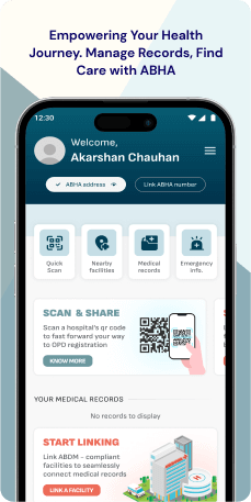
The ABHA (Ayushman Bharat Health Account) mobile application, created by the National Health Mission (NHM) as part of the Ayushman Bharat Digital Mission (ABDM), enables citizens in India to digitally oversee their health records.
Objective
The ABHA mobile app, launched by the National Health Mission, aims to achieve ambitious goals by providing Indian citizens centralized control over their health records, facilitating streamlined healthcare data exchange, and transforming the way individuals interact with their health information. Key Features-
- ABHA Address Creation - Users can generate a unique username ("ABHA address") for accessing and sharing their health records.
- Health Record Linking- Seamless connection of medical records from ABDM-compliant healthcare facilities to a centralized digital platform.
- Record Viewing and Management- Users can conveniently access their linked health records, encompassing lab reports, prescriptions, and vaccination certificates.
- Consent Management- Granular control is offered, allowing users to determine who can access specific health records and for what duration.
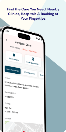
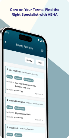
- Healthcare Facility Discovery- Users can easily locate participating healthcare facilities within the ABDM network.
- QR Code Registration- The application facilitates quick registration and record linking at ABDM-compliant facilities through the scanning of QR codes.
- Multi-lingual Support- Currently available in English and Hindi, with future for expansion to include other Indian languages.
Target Audience
The primary audience for the ABHA application is Indian citizens, healthcare providers and facilities participating in the ABDM network can also derive advantages from its features. The user base spans from individuals proficient in technology to those with limited digital literacy.
The Challenge
The ABHA application shows promise in health record management, it encounters obstacles in achieving widespread user adoption and meaningful impact. Challenges such as limited discoverability, intricate navigation, and inconsistent accessibility among different demographics and technology comfort levels impede a smooth user experience. It is imperative to tackle these crucial issues through a thorough UX audit and redesign, unlocking the application's full potential and enabling citizens to efficiently oversee their health data. Our engagement aims to transform the ABHA application into a user-centric platform, expanding its influence and effectiveness within the Indian healthcare realm.
Usability Study Findings
Insights into the usability of the ABHA application highlight challenges that must be addressed to achieve an improved user experience and foster greater engagement with the application's initiatives.
The summarized usability points are as follows-
Onboarding- Confusing Language Selection Confirmation Mechanism (Clarity and Control, Feedback, Efficiency)-Users encounter confusion during the initial onboarding process due to the absence of an explicit confirmation step after selecting a language. The use of radio buttons implies a choice-based decision, but clicking on a language option directly confirms the selection, creating uncertainty and a potential expectation gap for users.
- Information Overload and Untimely Permission Overview (Transparency, Clarity, User Control, Cognitive Load)- The onboarding process presents a screen titled "Application Permission" early on, displaying a dense block of text outlining permissions the application will seek later. This results in information overload, as users are overwhelmed with details before experiencing the application's functionalities. The untimely presentation of permission information disrupts the onboarding flow and lacks contextual relevance, potentially leading to disjointed consent.
- Inconsistent Carousel Functionality (Discoverability, Consistency, Clarity)-The splash screen's feature carousel intended to showcase application benefits exhibits two inconsistencies. Firstly, the carousel relies solely on user swipes for navigation, lacking autorotation, potentially overlooking users who expect automatic transitions. Secondly, the pagination dots, commonly used for carousel navigation, are unresponsive, causing confusion for users who expect them to function as visual indicators and interactive elements.
- Unclear Login Requirements and Terminology Confusion (Clarity, Consistency, User Guidance)- The login prompt on the splash screen introduces ambiguity regarding login requirements, specifically mentioning an "ABHA address" without providing clear explanations. The absence of guidance or tooltips to define ABHA-specific terms and guide users through the login process contributes to uncertainty and creates a barrier to understanding and engagement.
- Confusing Login Options and Diverted Focus (Clarity, Consistency, User Guidance)- The login screen presents a confusing array of options with competing login buttons ("Sign in/Sign up" and "Other Login Option") and separate prompts for different registration paths. The presence of a distracting carousel on the login screen diverts attention away from the primary task of entering credentials, causing unnecessary visual noise and interrupting user flow. Accessing registration options after clicking "Login" creates a disconnect and confusion about the intended actions and the application's functionality.
- Unbalanced Screen Layout and Visual Clutter (Visual Hierarchy, Efficiency, User Attention)- The login screen suffers from an uneven distribution of elements, with the top half overloaded with information and buttons while the bottom half remains empty white space. This unbalanced layout creates visual clutter, disrupts the user's focus, and hinders efficient interactions. The stark contrast between the information-heavy top and the empty bottom half of the screen results in inefficient use of space and potentially undermines the application's visual appeal.
- Unappealing Header Design and Unclear Button Affordance (Visual Design, Clarity, User Interaction)-The home Screen header, intended to convey essential user information and initiate actions, lacks visual appeal in its current design. The "View Complete Profile" button, blending in with surrounding text, lacks clear visual cues to indicate its interactive nature, potentially leading to user frustration and confusion.
- Unexpected Account Duplication and Lack of Management Options (User Flow, Clarity, Account Management)- The account switching feature on the home screen reveals the presence of multiple accounts, potentially stemming from inconsistencies in the signup process or onboarding experience. This leads to user frustration and confusion about managing multiple accounts and maintaining a clear user profile, with uncertainty about which account should be considered the primary or default one.
- Data Retrieval Failure and Inadequate Error Handling (Functionality, Error Management, User Guidance)-The application's integration with external health programs, specifically the COWIN feature, encounters a critical issue when attempting to retrieve user data based on their registered phone number. The process fails, leading to an unhelpful "no data found" error and abruptly ending the user journey without resolution. This failure results in user frustration and disappointment, eroding trust in the application's capabilities.
- Inconsistent Visual Design and Ineffective QR Code Display (Visual Design, Information Hierarchy, User Interaction)- The profile screen exhibits shortcomings in visual presentation and information layout, hindering user experience. The repetitive header design creates a monotonous experience, and the small size and unclear placement of the QR code make it difficult to scan and may be overlooked by users.
- Unclear Field Editability and Reliance on Non-Standard Cues (Visual Clarity, User Expectations, Interaction Design)- The profile section employs an unconventional method to distinguish editable fields from non-editable ones, relying solely on an "i" icon within the field. This deviates from common design conventions and risks confusing users who expect more explicit visual cues.
- Misplaced Feature Previews and Potential for Confusion (Information Architecture, User Expectations, Feature Management)- The settings screen presents two options, "Deactivate/Delete ABHA Address" and "Reactivate ABHA Address," with the label "Coming Soon," indicating they are not yet functional. This practice raises concerns about user expectations and the application's overall information architecture. Displaying non-functional features in a prominent settings area contributes to visual clutter and can lead to user frustration and confusion about the application's functionality.
Synthesizing Phase
With the insights gathered during the research phase, we have gained valuable understanding of the users' interactions and challenges while using the application of ABHA , Government of India. Building on this knowledge, we have now entered the Defining phase, where our aim is to deepen our comprehension and transform the research findings into practical design solutions. To maintain a user-centric approach, we have created personas that embody essential user archetypes-
User Personas Persona 1: Tech-Savvy ProfessionalJohn, a 32-year-old tech-savvy professional, aims to efficiently manage his health records using the ABHA app.
Goals-His primary goal is to have a centralized platform that allows seamless access to his medical history, lab reports, and vaccination certificates. He values the convenience of quick registration at healthcare facilities through QR codes, ensuring a hassle-free experience. As a user proficient in technology, John expects the application to provide clear navigation, a visually appealing interface, and granular consent management for sharing his health records securely.
Pain Points-However, John faces challenges with the onboarding process due to the confusing language selection confirmation mechanism. The lack of a dedicated confirmation step after choosing a language creates uncertainty, impacting his overall user experience. Additionally, the information overload during the permission overview disrupts the smooth onboarding flow, hindering John's ability to fully appreciate the application's functionalities. The inconsistent carousel functionality on the splash screen further adds to his frustration, as it does not meet his expectations for intuitive navigation.
Persona 2- Elderly User with Limited Digital LiteracyMrs. Sharma, a 65-year-old with limited digital literacy, aims to use the ABHA application for easy management of her health records.
Goals-Her primary goal is to access and view her linked medical records without difficulty. Mrs. Sharma values simplicity, clear guidance, and a user-friendly interface. She appreciates features that help her locate healthcare facilities easily within the ABDM network. Mrs. Sharma also wishes to have a straightforward login process and clear visual cues within the application to enhance her understanding.
Pain Points-However, Mrs. Sharma encounters challenges related to unclear login requirements and terminology confusion. The ambiguity around the "ABHA address" and the absence of tooltips contribute to her uncertainty during the onboarding process. The confusing login options and the presence of a distracting carousel on the login screen create a sense of overwhelm for Mrs. Sharma, diverting her attention from the primary task of logging in. The unbalanced screen layout and visual clutter further add to her difficulties, making it challenging for her to efficiently interact with the app.
Mapping User Journeys and Extracting InsightsWe have selected Mrs. Sharma, a 65-year-old with limited digital literacy, to gain insights into her needs, pain points, and behaviors while using the ABHA Mobile Application. Mrs. Sharma's journey provides valuable perspectives on the challenges she faces, helping us identify areas for improvement within the application. These insights will guide efforts to enhance Mrs. Sharma's overall experience in managing her health records.
User Story"As Mrs. Sharma, a 65-year-old with limited digital literacy, I aim to use the ABHA Mobile Application for easy management of my health records. I want a straightforward and user-friendly experience to access and view my linked medical records without confusion. However, I face challenges in the login process due to unclear requirements, and the distracting elements on the login screen add to my overwhelm. The unbalanced layout and visual clutter make it difficult for me to efficiently interact with the app."
User Statement"I am Mrs. Sharma, an elderly user with limited digital literacy, seeking a simple and clear experience with the ABHA Mobile Application. I desire an intuitive login process, free from ambiguity around terms like 'ABHA address.' The confusing login options and distracting elements create challenges, making it hard for me to access and view my health records. An improved application with clear guidance and a user-friendly layout would greatly enhance my ability to manage my health information effectively."
Framing challenges and hypothesis Problem StatementMrs. Sharma, using the ABHA application, encounters difficulties related to the application's login process, confusing terminology, and distracting interface elements. These challenges impact her ability to efficiently manage her health records, particularly in accessing and viewing the information.
Hypothesis StatementIf we enhance the application's login process by providing clear explanations of terms like 'ABHA address,' simplify login options, and reduce distracting elements, then Mrs. Sharma's experience on the ABHA Mobile Application will become more user-friendly, addressing her specific challenges and enabling her to manage her health records with ease.


