introduction
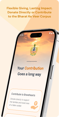
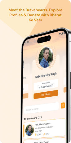
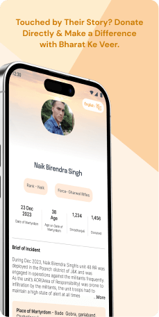
The "Bharat Ke Veer" application stands as a dedicated platform honoring the courageous soldiers of the Central Armed Police Forces (CAPF) who make the ultimate sacrifice in the line of duty. It allows citizens to pay homage by making direct financial contributions to the bank accounts of the families of these Bravehearts or to the "Bharat Ke Veer" corpus, which is managed by a committee. With a contribution cap of 15 lakhs per Braveheart, donors are alerted if the limit is exceeded. The corpus ensures equitable fund disbursement, supported by a secure payment system through the State Bank of India, fostering awareness and support for the families of the fallen heroes.
Objective
The "Expressing Gratitude" initiative's main objective is to empower citizens to convey their appreciation and support for the courageous soldiers of the Central Armed Police Forces (CAPF) who make immense sacrifices in the line of duty. The overarching goal is to establish a dedicated platform that allows users to pay homage and express gratitude for the unwavering dedication and sacrifice of these Bravehearts. In parallel, the initiative aims to facilitate direct financial contributions from citizens to the bank accounts of the families of fallen soldiers, ensuring tangible support to help them navigate the challenges arising from the loss of their loved ones. With a cap set at 15 lakhs per Braveheart for individual contributions, the initiative also incorporates alert mechanisms to notify donors and provide them with options for adjusting or redirecting their donations. Furthermore, a committee comprised of eminent individuals and senior government officials oversees the "Bharat Ke Veer" corpus, ensuring transparent and equitable fund disbursement based on the needs of the families. The initiative also focuses on disseminating information about the various Central Armed Police Forces (CAPFs) under the Ministry of Home Affairs, fostering increased awareness among application users. To secure financial transactions, the initiative integrates with the State Bank of India, establishing a reliable and trustworthy payment process that instills confidence among users contributing to this noble cause.
Target Audience
The primary audience for this initiative comprises Indian citizens seeking to show their solidarity with the families of fallen soldiers. It is designed for individuals who wish to make direct contributions to the bank accounts of Braveheart's kin or to the "Bharat Ke Veer" corpus to express their support.
The Challenge
The challenges in the application span an overloaded splash screen, inconsistencies in appearance across devices, navigation issues, and typography concerns. Non-responsive design and unclear actions hinder usability. Addressing these complexities is vital for fostering a seamless, user-friendly experience that enhances satisfaction and engagement throughout the application.
Usability Study Findings
The usability study revealed several critical insights across various screens in the application
Splash Screen- Text Overload and Clickability Concerns- The splash screen overwhelms users with excessive text, hindering quick comprehension and violating the Visibility of System Status principle. Additionally, the Call-to-Action (CTA) button lacks clear clickability, potentially reducing user engagement and conversions.
- Inconsistencies in Appearance and Interaction- Inconsistent appearance between Android and iOS devices disrupts the visual coherence, violating the Consistency and Standards principle. Issues with padding, layout in the accessibility music control radio option, and non-recognizable hamburger menu icon hinder user interaction and navigation.
- Typography and Layout Challenges- Inconsistent font usage, color schemes, and unclear actions in the announcement banner impact visual coherence, violating design consistency principles. The search bar designed as a CTA button and inconsistent layout on the homepage introduce confusion and disrupt aesthetics.
- Design Inconsistency and Layout Issues- Clicking on card images introduces inconsistency and hampers design coherence. The proportional layout on the Braveheart page for mobile devices is suboptimal, affecting user experience.
- Hierarchy and Functionality Concerns- The unclear hierarchy of CTA buttons in the search card causes confusion about action prominence. Ineffective dropdown field functionality on the Brave Heart page hinders user understanding and interaction.
- Repetitive Entry and Lack of Options- The repetitive entry process on the "Please Enter Your Details" page negatively affects user experience, violating the Minimize User Effort principle. Lack of an OTP resend option and navigation back functionality upon incomplete OTP receipt can lead to frustration, conflicting with the Visibility of System Status principle.
- In summary, the study highlights various design and usability issues across different screens, emphasizing the need for improvements to enhance user satisfaction, engagement, and overall usability.
Synthesizing Phase
With the insights gathered during the research phase, we have gained valuable understanding of the users' interactions and challenges while using the application of Bharat Ke veer - India’s Bravehearts, Government of India. Building on this knowledge, we have now entered the Defining phase, where our aim is to deepen our comprehension and transform the research findings into practical design solutions.
To maintain a user-centric approach, we have created personas that embody essential user archetypes-
User Personas Persona 1: Patriotic PhilanthropistAarav, a 35-year-old entrepreneur and a proud Indian citizen deeply passionate about supporting the armed forces.
Goals-Aarav's goal is to express his gratitude and solidarity with the families of fallen soldiers by making direct financial contributions through the "Bharat Ke Veer" app. His primary objective is to contribute to the well-being of these Bravehearts' families and ensure that they receive tangible support in times of need.
Challenges-Aarav, however, faces the challenge of navigating through the overloaded splash screen and dealing with inconsistencies in the application's appearance across his multiple devices. Additionally, the non-responsive design and unclear actions make it difficult for him to complete his donation efficiently. Aarav's desire is for a seamless and user-friendly experience that allows him to express his patriotism and philanthropy without any hindrance. The hindrance is seen
Persona 2: Concerned CitizenPriya, a 28-year-old government employee who holds a deep appreciation for the sacrifices made by the Central Armed Police Forces (CAPF).
Goals-Priya's goal is to contribute to the "Expressing Gratitude" initiative and express her support for the families of fallen soldiers. She aims to utilize the "Bharat Ke Veer" application to make direct financial contributions within the prescribed limit of 15 lakhs per Braveheart.
Challenges-Priya faces challenges related to typography concerns and navigation issues within the app. The unclear actions and inconsistent appearance across devices pose usability hurdles for her. Priya's objective is to overcome these challenges and have a smooth, hassle-free experience while ensuring that her contribution reaches the families in need. She seeks a user-friendly interface that aligns with her intention of showing solidarity with the Bravehearts' families.
Mapping User Journeys and Extracting InsightsWe have chosen Aarav, a 35-year-old entrepreneur with a fervent desire to support the families of fallen soldiers, to gain a thorough understanding of his needs, challenges, and behaviors while utilizing the "Bharat Ke Veer" app. Aarav's journey serves as a lens through which we can uncover the pain points he encounters and identify opportunities for enhancement in the application, aiming to provide him with a more seamless and gratifying experience while contributing to the "Expressing Gratitude" initiative.
Aarav's User Story"As a patriotic philanthropist, I want to express my gratitude and support for the families of fallen soldiers by making direct financial contributions through the 'Bharat Ke Veer' app. I aim for a seamless and user-friendly experience during the donation process."
Framing challenges and hypothesis Problem StatementAarav faces challenges in navigating the overloaded splash screen, dealing with inconsistencies in the application's appearance across devices, and encountering non-responsive design issues. These complexities hinder his ability to contribute efficiently and may lead to frustration.
Hypothesis StatementIf we streamline the splash screen, ensure consistency in the application's appearance across devices, and enhance the responsiveness of the design, then Aarav's experience on the "Bharat Ke Veer" application will become more user-friendly, allowing him to express his patriotism and philanthropy seamlessly.
Extracting InsightsThrough Aarav's journey, key insights have emerged. Aarav prioritizes a swift and straightforward entry into the app, emphasizing the significance of optimizing the splash screen to enhance his initial interaction and establish a positive tone for the donation process. Furthermore, his utilization of multiple devices underscores the necessity for a consistent user experience across platforms, aiming for uniformity in appearance to foster a cohesive and trustworthy app. Additionally, Aarav's challenge with non-responsive design emphasizes the critical need to make the application adaptable to diverse screen sizes and resolutions, ultimately improving accessibility and ease of use.
In the subsequent sections, we will explore and propose concrete design solutions to address these insights, aiming to provide Aarav with a more satisfying and efficient experience while contributing to the "Expressing Gratitude" initiative.


