introduction
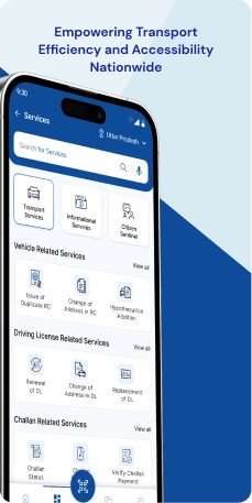
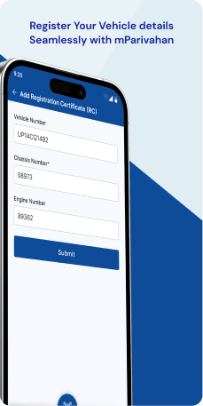
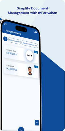
mParivahan, a mobile application by the Ministry of Road Transport & Highways in India, offers citizens swift access to transport-related information and services. With a focus on user convenience and system transparency, the application enables users to easily identify vehicle owners using registration numbers. Additionally, it provides online services such as appointment booking, status checks, test applications, and other related functionalities, contributing to a more efficient and user-friendly transport system.
Objective
The mParivahan application has a core objective of digitizing and streamlining services within the Indian Transport Sector. It aspires to serve as a comprehensive platform, ensuring a one-stop solution for all RTO-related services, ultimately enhancing citizen convenience and system transparency.
The goals of mParivahan encompass providing seamless access to Transport Sector services, fostering transparency through digital processes and status updates, consolidating services for user convenience, enhancing sector efficiency by minimizing paperwork and expediting processes, and promoting public education about Transport Sector rules and regulations for safer road behavior. The overarching aim is to revolutionize citizens' interactions with the Transport Sector in India, making services easily accessible, transparent, and efficient.
Target Audience
The mParivahan application is crafted to serve a diverse user base within the Indian transport sector, targeting specific audiences across various age groups-
- Vehicle Owners (18 and above)- The application caters to vehicle owners, providing services such as vehicle registration, transfer of ownership, hypothecation management, application for duplicate registration, and address change.
- Drivers (18 and above)- Individuals possessing a driving license can utilize the application to book appointments for new or renewed licenses, apply for duplicate licenses, and check application statuses.
- Learners (16 and above for learner's license)- The application supports those learning to drive by offering online tests for obtaining a learner's license.
- Transport Operators (18 and above)- Services like National Permit and Fancy Number Allocation are available to transport operators through the application.
It's important to note that the specified age groups align with the legal driving age in India. The application 's design emphasizes enhancing convenience and transparency within the system, simplifying the navigation of the transport sector for citizens.
The Challenge
The mParivahan application, while offering a range of services for the transport sector in India, faces several challenges. Digital literacy, particularly among older users, may impede effective utilization. Connectivity issues in areas with poor network coverage could hinder real-time functionality. Uploading required documents and addressing language diversity present additional hurdles. Robust user verification processes are crucial for maintaining the authenticity of user information. Technical glitches, such as application crashes or slow loading times, may impact the overall user experience. Moreover, ensuring legal compliance with diverse and evolving regulations across Indian states poses a challenge for the application. Addressing these challenges is vital to achieving the application's goals of convenience and transparency in the transport sector.
Usability Study Findings
The usability study revealed several critical insights into user behavior, pain points, and preferences across various sections of the application.
- Login Screen Insights
- Home Screen Insights
- Virtual Documents Insights
- Virtual RC Insights
- Raise Complaint Insights
- Hamburger Menu Insights
Users expressed frustration with the persistent sign-in requirement, highlighting a desire for a more balanced approach between security and convenience. The current authentication process, requiring a 6-digit Mpin or Face ID for iOS devices on every access, contradicts principles of user-friendly experiences.
The search bar functionality on the home screen emerged as a significant pain point. Users reported confusion as the displayed content failed to dynamically update despite selecting specific Call-to-Action (CTA) options. Additionally, issues with the layout and spacing of CTAs within alert cards compromised visual clarity and hindered intuitive interaction.
In the Virtual Documents section, users encountered non-intuitive interactions when attempting to access Driver's License (DL) information. Clicking on the DL Information card did not provide the expected details, requiring an additional step through a three-dot menu. Simplifying this interaction for direct access to DL information became a crucial insight.
The "Create Virtual RC" page faced challenges with the placement and spacing of CTAs within the "My Virtual RC(s)" card. The closely positioned CTAs lacked visual distinction, impacting both aesthetics and user interaction. Redesigning the layout for clearer visual spacing among CTAs emerged as a recommendation.
The "Raise Complaint" page exhibited design inconsistencies in UI elements, spacing, and visual styles. Users reported potential confusion with dropdown selections sharing the same visual style as primary CTAs. Standardizing these elements and improving consistency in spacing became essential for enhancing user interaction.
Inconsistencies in button design on the nearby screen within the Hamburger Menu raised concerns. Users noted variations in size, color, and style, potentially causing confusion. Standardizing button design for fundamental interactive elements emerged as a crucial recommendation for improving user navigation and satisfaction.
Overall, the study emphasizes the need for a balance between security and convenience, streamlined user journeys through intuitive designs, and maintaining visual coherence across different sections of the application.
Synthesizing Phase
With the insights gathered during the research phase, we have gained valuable understanding of the users' interactions and challenges while using the application of the mParivahan, Government of India. Building on this knowledge, we have now entered the Defining phase, where our aim is to deepen our comprehension and transform the research findings into practical design solutions. To maintain a user-centric approach, we have created personas that embody essential user archetypes-
User Personas Persona 1-Mr. Sharma, a 58-year-old Vehicle OwnerMr. Sharma is a middle-aged individual who owns a car and resides in a semi-urban area. He has been driving for several years and is accustomed to traditional methods of dealing with the Regional Transport Office (RTO). While he acknowledges the benefits of technology, he is not very digitally literate and prefers face-to-face interactions for official matters.
Goals-Mr. Sharma's primary goal is to seamlessly manage his vehicle-related services without the hassle of visiting the RTO physically. He aims to renew his vehicle registration, address changes, and manage hypothecation through the mParivahan application. His ideal scenario is to have a simplified platform where he can easily navigate through services without relying heavily on digital expertise.
Pain Points-The challenge for Mr. Sharma lies in adapting to digital processes, as he is not well-versed in technology. He may find it difficult to upload necessary documents and navigate through the application efficiently. Connectivity issues in his semi-urban area may further hinder his real-time interactions, making the transition to the mParivahan application a potential source of frustration for him.
Persona 2- Ms. Patel, a 24-year-old LearnerMs. Patel is a young professional residing in a metropolitan city. She recently moved to the city for work and is in the process of obtaining her driving license. Being tech-savvy, she is inclined towards using digital solutions for her daily tasks and seeks convenience in managing her documents and licenses.
Goals-Ms. Patel's primary goal is to efficiently acquire her learner's license through the mParivahan application. She aims to take advantage of the online tests offered by the application to prepare for the examination. Additionally, she wants to track the status of her license application and, eventually, smoothly transition to a permanent driving license.
Pain Points-For Ms. Patel, the key concern is the potential occurrence of technical glitches in the application, leading to delays or disruptions in her license application process. She expects a user-friendly interface and efficient services but might find it frustrating if the application crashes or experiences slow loading times. While she is digitally literate, any complexities in the application's design might pose a challenge for her.
Mapping User Journeys and Extracting InsightsWe have chosen to focus on Mr. Sharma's journey with the mParivahan application, revealing challenges stemming from his limited digital literacy. From initial discovery through word of mouth, onboarding hurdles, and navigation difficulties to connectivity issues, transaction complexities, and seeking support, Mr. Sharma underscores the importance of user-friendly experiences for those less tech-savvy. Face-to-face interactions, addressing connectivity concerns, and streamlined navigation emerge as crucial components for a positive user experience.
Mapping the journey to a “user story”Mapping Mr. Sharma's user journey with the mParivahan application reveals crucial touchpoints in his digital experience. Tailored to his needs as a less tech-savvy vehicle owner, the journey highlights challenges during onboarding, navigation, and transactions. It uncovers key pain points, emphasizing the importance of user-friendly design, clear instructions, and accessible support for individuals with limited digital literacy.
Mr. Sharma's User Story"As a vehicle owner unfamiliar with digital processes, I want a user-friendly and assisted experience on the mParivahan application so that I can manage my vehicle-related services seamlessly without relying heavily on digital expertise."
Framing challenges and hypothesisHaving dissected Mr. Sharma's journey with the mParivahan application, we pivot to crafting a problem statement encapsulating the challenges he encounters. This process aims to identify the hurdles and pain points in Mr. Sharma's user experience, laying the foundation for hypothesis formulation and potential solutions to enhance the application's usability for users with limited digital literacy.
Problem Statement"Mr. Sharma, a vehicle owner, needs a user-friendly and assisted digital platform for managing vehicle-related services as his limited digital literacy and connectivity issues hinder his efficiency in using the mParivahan application."
Hypothesis Statement"If we provide user assistance, simplify the navigation, address connectivity concerns, and offer clear instructions within the mParivahan application, Mr. Sharma's experience will become more efficient and satisfying, promoting the adoption of digital processes for vehicle-related services."


