introduction
NICler is an Android application designed to facilitate teachers in conducting quizzes and managing attendance through ArUco markers scanning. Leveraging the smartphone's camera, the application captures data from QR codeArUco markers by students, including student IDs or quiz responses, and automates tasks like recording attendance or calculating quiz scores.
Objective
The purpose of this website is to offer assistance and direction in realizing the vision, goals, and objectives of the Digital India program. The program is dedicated to advancing digital initiatives and transforming governance in India.
- Gather Student Responses- The application’s primary goal is to collect students' answers to multiple-choice questions, all without requiring the use of electronic devices. This is likely achieved through the integration of OpenCV and ArUco marker technology.
- Enhance Grading Efficiency- The application's functionality streamlines the grading process by automating the capture and organization of student responses. By eliminating manual data entry and providing a digital record of student answers, the application has the potential to save time and effort for teachers and administrators.
- Automatic Attendance Logging: NICler automates the process of logging attendance data, including the date, time, and student ID, making it easier for teachers to maintain accurate attendance records without manual data entry.
- Attendance Reports: The application generates attendance reports for teachers and administrators, making it convenient to review attendance trends, identify patterns, and take appropriate actions when necessary.
Target Audience
- Primary Users - Government Teachers- Government teachers are the core users of the NICler application. They employ the application to create, administer, and manage quizzes and assessments for their students. Through the use of ArUco markers and computer vision technology, the application enables teachers to generate multiple-choice questions and capture student responses. Additionally, teachers can utilize the application to monitor attendance. NICler's features significantly streamline the assessment process, reduce manual grading tasks, and provide an efficient means of managing student answers.
The Challenge
The challenge at hand involves improving the user experience of NICler by overcoming potential hurdles that users might face. These significant challenges encompass creating a frictionless onboarding process, ensuring consistent ArUco markers scanning, offering transparent guidance and feedback, enhancing accessibility, and designing an intuitive and easy to use interface.
UX Observations and PointersHere are the UX observations gathered during the audit of the application-
Registration Flow- Complex Registration Flow- Enhancing the registration process is essential, as it currently appears unnecessarily complex. We can simplify it by shifting registration to the backend, so that for logging in, we only need to collect the user's phone number and verify it with a One-Time Password (OTP). (Emphasizing Simplicity and Minimalism)
- PIN-Based Security- Each phone should require the setup of a unique PIN that functions exclusively on that specific mobile device. This ensures robust security and privacy. (Prioritizing Security and Privacy)
- Consistent Login Method- In both the registration and login processes, it would be advantageous to offer users a consistent login method that functions seamlessly regardless of the device they are using. (Focusing on Consistency and Standards)
- Restrictive User Control- Users currently face limitations such as the inability to register with a new phone number when a different number is already registered on the device. Additionally, there's a lack of a login option for existing users on a new device. This hampers user control and freedom. (Highlighting Issues with User Control and Freedom)
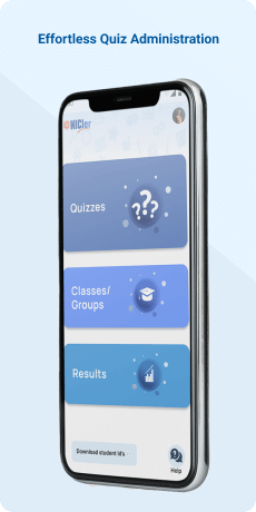
- Inconsistent Visual Elements- The icons and text on the landing screen lack visual alignment and proportion, negatively impacting the overall visual appeal and readability of the screen. (Emphasizing Visual Consistency)
- Decluttering the Landing Screen- The "Upload Offline Data/Sync Master Data" features are infrequently used by users and can be relocated to the menu to simplify the landing screen. This adjustment allows users to focus on more commonly used options. (Addressing Simplicity and Minimalism)
- Redundant Logout Option- The presence of the logout option on this screen is redundant since it is already available in the menu items. This redundancy affects the consistency and standardization of the interface. (Highlighting Issues with Consistency and Standards)
- Non-Intuitive Attendance Marking- The option for marking student attendance is not intuitive and should be made more user-friendly. Consider incorporating it into other navigation options for improved intuitiveness and learnability. (Stressing the Need for Intuitiveness and Learnability)
- Clarity and Simplification- The need for user-selectable data source buttons can be eliminated. Instead, we can implement an automated data retrieval process. This would relieve users from the task of choosing a data source and guarantee that the application intelligently fetches the most pertinent and current data. (Enhanced Automation and Convenience)
- Restricted NICler ID Editing - Currently, users can edit NICler IDs for classes not assigned to them or without the proper authority. It is essential to restrict users to edit NICler IDs solely for their respective class(es) or classes explicitly granted by higher authorities. This measure safeguards data integrity and prevents unauthorized modifications to NICler IDs. (Access Control and Permission Management)
- Simplification through Elimination of Parent Names- The inclusion of parent names alongside student names introduces unnecessary complexity and has the potential to confuse users. (Simplicity and Minimalism)
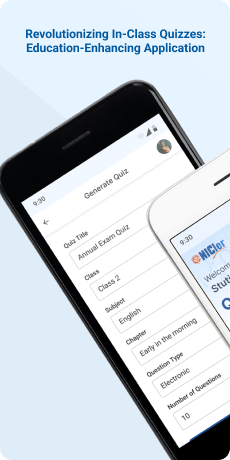
- Simplify Quiz Generation Flow- Upon selecting the "Generate Quiz" option, the application should promptly display the relevant screen. This action minimizes any potential confusion arising from displaying multiple options and guarantees a straightforward process for quiz creation. (Enhancing Clarity and Context)
- Eliminate Unnecessary Choices- The options for "Download Saved Quiz" and "Standard Quiz" are extraneous in the current stage of quiz generation. To enhance simplicity and reduce clutter and confusion, these choices should be removed from the current screen. (Streamlining for Simplicity and Minimalism)
- Add Visual Feedback for Selected Chapter- The selection screen should provide visual feedback to indicate the chosen chapter after a user selects. This absence of feedback can result in user confusion and uncertainty about their selected chapter. (Enhancing Feedback and User Response)
- Provide Preview of Generated Quiz- Instead of immediately prompting users to submit the quiz, offer them a preview of the generated quiz, including questions, answer options, and any other relevant information. This empowers users with an overview of the quiz content and the ability to make edits if necessary. (Enhancing User Control and Freedom)
- Display List of Generated Quizzes- Instead of presenting a confirmation message upon quiz submission, redirect the user to a screen displaying a list of all generated quizzes. On this screen, prominently feature a Call-to-Action (CTA) button or option that enables users to create a new quiz. This approach enhances consistency and efficiency in the user experience. (Consistency and Efficiency)
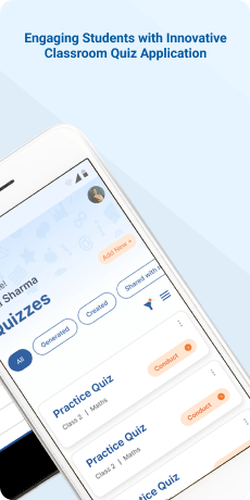
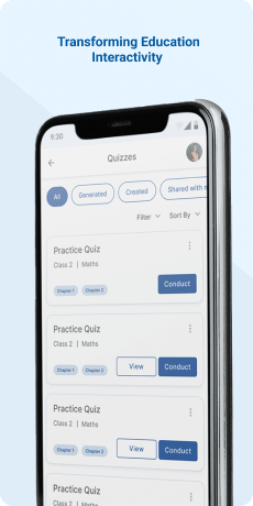
- Implement Display of Saved Quizzes- A dedicated screen prominently showcasing a list of all saved quizzes should be introduced. This list should include essential details such as quiz titles, dates, class, and subject information. By organizing the quizzes in a structured manner, users can effortlessly browse and access their saved quizzes, improving information hierarchy and organization.
- Introduce Sorting Filters- To enhance flexibility and customization, incorporate sorting filters on the screen displaying the list of quizzes. These filters will enable users to easily locate a specific quiz when needed, improving the overall usability of the feature.
- Rearrange "Create Own Quiz" Option- The current placement of the "Create Own Quiz" option within the hamburger menu hinders easy navigation and clarity of use. It should be relocated and grouped with other options related to quiz creation to improve visibility and discoverability.
- Add Option to Add Questions in Quiz Creation Flow- After entering class, subject, and quiz name, users should be immediately presented with an option to add questions or edit the quiz. The absence of this feature creates a usability issue, as users may expect immediate access to the newly created quiz for further customization, enhancing efficiency of use.
- Streamline Question Addition Process- The current method requires users to first create a quiz by entering class, subject, and quiz name, and then navigate to a separate screen to add questions. This process can be made more efficient by allowing users to specify the number of questions directly during quiz creation and enabling them to add questions on the same screen, simplifying the overall process.
- Eliminate Redundant "Cancel" Button- The presence of the "Cancel" call-to-action (CTA) button on the Quiz Creation screen duplicates the functionality already provided by the back button in the top panel. This redundancy can lead to confusion and introduces an unnecessary element on the screen. Consider removing the redundant "Cancel" button to enhance consistency and reduce redundancy.
- Reorder "Create Quiz" Button- The "Create Quiz" button should not be presented before users enter all the required details of a quiz. Reordering it to appear after all necessary information has been provided improves efficiency and simplifies the user flow. (Efficiency and Simplicity)
- Improve Visual Feedback for Quiz Categories- The "Conduct Quiz" screen lacks clear visual feedback to effectively inform users about the selection of different quiz categories. Enhancing visual cues and feedback in this UI element can improve user understanding and responsiveness.
- Overcrowded UI Elements in the "Capture" Screen- The current design of the "Capture" screen suffers from overcrowded UI elements, which consume a significant portion of the screen real estate. To address this issue, consider reorganizing or removing certain elements to create more space for the primary area dedicated to viewing the camera feed. For instance, the list of students could be placed inside a collapsible button to reduce clutter and improve information hierarchy.
- Eliminate Redundant Buttons in the Question Screen- The current design of the question screen includes unnecessary redundant buttons that can be removed to simplify the user interface. For example, the "Correct Option" button is redundant as the correct option can be visually differentiated. Streamlining the UI in this manner enhances simplicity and minimalism.
- Reconsider Landscape as Default Orientation and Button Design- The default landscape orientation for displaying questions and the capture screen lacks a clear rationale and may not offer the best user experience. Additionally, the current design of the question screen incorporates multiple buttons that could be more efficiently represented using icons and placed within a navigation panel. The existing buttons are not intuitive and may lack differentiation, potentially causing confusion for users. Addressing these issues improves flexibility, efficiency of use, and aesthetic minimalism in the design.
- Implement Filters for Quiz Results- The absence of filters to view quiz results based on class or subject is a notable deficiency. Furthermore, incorporating date selection functionality within the filters section can create a more seamless and cohesive user experience. These enhancements improve flexibility and efficiency of use for users seeking specific quiz results.
- Eliminate Redundant "Student Result" Button- The presence of the "Student Result" call-to-action (CTA) button on the quiz card is redundant since clicking on the card itself can already direct users to the quiz result page. This redundancy creates confusion and adds an unnecessary element to the user interface. To streamline the user experience, consider removing the redundant button and relying on the card click action to access quiz results. This minimizes redundancy and enhances user interface simplicity.
- Streamline Group Creation Process for Adding Members- The current process of creating a group first and then navigating to a separate screen to add members is inefficient. To enhance efficiency and user intuitiveness, users should be allowed to add members during the group creation itself, simplifying the process.
- Implement Bulk Member Addition Option- The current manual entry of member details during group creation can be improved by providing a bulk member addition option. This feature would enable users to add multiple members at once, enhancing efficiency and giving users more control and freedom in managing group memberships.
- Display Assigned Classes for Better Organization- The absence of visibility for assigned classes in this section can lead to confusion for users. To improve user understanding and organization, consider enhancing this section to include a list of assigned classes. This addition will provide users with a comprehensive view of their groups and facilitate better organization and navigation.
- Implement a Quiz Library- Create a dedicated section within the application where users can access a library of all available quizzes. From this library, users should be able to conduct quizzes directly, eliminating the need for the "Download Saved Quiz" option on the initial screen. This enhancement enhances the application's organization and simplifies the process for users to find and access desired quizzes, promoting ease of navigation and adhering to consistency and standards.
- Clarify Quiz Types- Improve the labeling or organization of different types of quizzes to make it clear to users that they can access various quiz types in one place. Enhancing the clarity and communication around the availability of different quiz types will make it more intuitive for users to understand their options.
- Optimize Screen Space on the Scan Screen- When the camera is active, more than half of the screen is occupied by other UI elements, reducing the available space for the camera view, which is crucial for scanning. Optimize the layout to prioritize the camera view and minimize the presence of unnecessary UI elements during scanning, optimizing screen space usage.
- Streamline Workflows- Identify and address any unnecessary or repetitive steps in the application's workflows to improve user productivity. Streamlining workflows enhances efficiency and flexibility of use, ensuring that users can complete tasks more effectively.
- Establish Consistent Navigation- Implement a consistent navigation structure across all screens to make it easier for users to locate and access different features or sections within the application. Consistency in navigation promotes a more user-friendly experience and adheres to consistency and standards throughout the application.
Usability Study Findings
Based on the insights gathered from the usability study, several key findings have emerged regarding user behavior, pain points, and preferences. These findings can be summarized as follows:
Complex Registration Flow:- Users find the current registration process unnecessarily complex and prefer a simpler, backend-based registration with phone number and OTP verification.
- Consistency in login methods across devices is highly desirable.
- Users value PIN-based security for their mobile devices to ensure data privacy.
- Users value PIN-based security for their mobile devices to ensure data privacy.
- Users express frustration over restrictions in changing phone numbers and the absence of a login option on new devices.
- They desire more control and freedom in managing their account settings.
- Users are bothered by inconsistent visual elements on the homepage, which affect readability and overall appeal.
- Users prefer a decluttered landing screen and want infrequently used features like "Upload Offline Data/Sync Master Data" moved to the menu.
- Redundant logout options should be removed for better consistency.
- Users find the current attendance marking option non-intuitive and suggest integrating it with other navigation options for better usability.
- Users prefer a simplified NICler ID assignment process with automated data retrieval and reduced user-selectable options.
- Strong access controls are needed to prevent unauthorized NICler ID edits.
- Eliminating parent names from student profiles is desirable.
- Users want a simplified quiz generation flow with fewer choices and a more straightforward process.
- Visual feedback for selected chapters is necessary.
- Providing a quiz preview before submission enhances user control.
- Users prefer a list of generated quizzes after submission instead of a confirmation message for better consistency and efficiency.
- Users want a dedicated screen to display saved quizzes with sorting filters for easier access and organization.
- Users find the current placement of the "Create Own Quiz" option inconvenient and suggest better visibility.
- Adding questions during quiz creation and streamlining the process is preferred.
- Removing the redundant "Cancel" button and reordering the "Create Quiz" button simplifies the user flow.
- Users seek improved visual feedback for quiz categories.
- The "Capture" screen should have a less crowded UI with optimized button design.
- Reconsidering the default landscape orientation and button design can enhance user experience.
- Users want filters for quiz results, including class and subject.
- The redundant "Student Result" button should be removed for a cleaner interface.
- Streamlining the group creation process by allowing members to be added during creation is preferred.
- The redundant "Student Result" button should be removed for a cleaner interface.Implementing a bulk member addition option is desirable.
- Displaying assigned classes for better organization is needed.
- Implementing a quiz library for direct quiz access simplifies the process and promotes consistency.
- Clarifying different quiz types for users is essential.
- Users prefer a scan screen layout that prioritizes camera view and minimizes unnecessary UI elements during scanning.
- Users expect more streamlined workflows with fewer unnecessary or repetitive steps to improve productivity.
- Users appreciate consistent navigation structures across all screens for easier access to features and sections within the application.
These insights highlight the importance of simplifying the user experience, enhancing visual consistency, and addressing pain points related to usability, security, and control in the application's design and functionality.
Synthesizing Phase
With the insights gathered during the research phase, we have gained valuable understanding of the users' interactions and challenges while using the website of NICler, a Mobile Application for the School Education Department in Chhattisgarh. Building on this knowledge, we have now entered the Defining phase, where our aim is to deepen our comprehension and transform the research findings into practical design solutions. To maintain a user-centric approach, we have created personas that embody essential user archetypes-
User Personas User Persona 1: Government Teacher - Sarah Background-Sarah is a 35-year-old government schoolteacher working in Chhattisgarh, India. She has been teaching for over 10 years and provides quality education to her students.
Frustrations- RajeshFrustration 1: Complex Registration Process: Sarah is frustrated with the current registration process in NICler, finding it time-consuming and complex. She wants a simpler and more efficient way to access the platform using her phone number and a One-Time Password (OTP) to save time and focus on teaching.
Frustration 2: Attendance Management Complexity: Sarah struggles with the unintuitive interface for marking student attendance in NICler. She needs a more user-friendly approach that allows her to efficiently manage attendance records, ensuring accurate tracking of student presence without unnecessary complexity.
Wants and NeedsNeed 1: Simplified and Secure Registration: Sarah needs a simplified and secure registration process. NICler should streamline registration by requiring only her phone number initially, followed by an OTP for verification. This approach minimizes the information needed during registration and enhances security, allowing her to access the platform quickly.
Need 2: Intuitive Attendance Management: Sarah wants an intuitive and user-friendly interface for marking student attendance. NICler should redesign the interface, making attendance management seamlessly integrated into navigation options with clear visual cues. This will help her save time and ensure accurate attendance tracking.
User Persona 2: Government Official - Rajesh BackgroundRajesh is a 40-year-old government official working for the School Education Department in Chhattisgarh, India. His role involves visiting various educational institutions to conduct quizzes and assessments using the NICler application.
FrustrationsFrustration 1: Overcrowded UI in "Capture" Screen: Rajesh is frustrated with the overcrowded user interface in NICler's "Capture" screen when administering quizzes. He needs a streamlined interface that allows him to focus on the assessment process without the distraction of cluttered UI elements.
Frustration 2: Lack of Data Organization and Filters: Rajesh faces difficulties in organizing and filtering quiz results in NICler. He wants better data organization and filter options that allow him to view quiz results based on class, subject, and date to evaluate educational institutions more effectively.
Wants and NeedsNeed 1: Streamlined "Capture" Screen: Rajesh needs a redesigned "Capture" screen in NICler that prioritizes the camera view for scanning. Unnecessary UI elements should be reorganized or removed to enhance the efficiency of quiz administration, making the assessment process smoother and less cluttered.
Need 2: Improved Data Organization and Filters: Rajesh wants NICler to introduce filtering options for quiz results based on class, subject, and date. These filters should be seamlessly integrated, allowing him to access specific data efficiently and make informed decisions while evaluating educational institutions.
Mapping User Journeys and Extracting InsightsSarah, a dedicated government schoolteacher in Chhattisgarh, faces several challenges in her user journey with the NICler application. The registration process proves complex and time-consuming, suggesting a need for a simplified and secure registration method. The homepage's lack of visual consistency and user-friendliness adds to her frustration, pointing to the importance of a more organized and user-friendly homepage. When managing attendance, Sarah finds the process unintuitive, emphasizing the need for a redesign with clear visual cues. Lastly, the quiz creation process is confusing, indicating the necessity for a streamlined and user-friendly approach. Addressing these insights can significantly enhance Sarah's user experience, making NICler a more efficient and teacher-friendly tool.
Mapping the journey to a “user story”After analyzing Sarah's user journey with the NICler application, we have gained valuable insights into her interactions, frustrations, and needs. Sarah's primary need revolves around simplifying her experience with NICler. Based on these observations, we've distilled one of Sarah's key needs into the following user story:
Sarah's User Story:"As a dedicated government teacher, I want a streamlined and user-friendly NICler application that simplifies registration, attendance management, and quiz creation processes, so I can focus more on teaching and efficiently conduct quizzes and attendance tracking."
Framing Challenges and HypothesisHaving examined Sarah's user journey, we can now formulate a problem statement that encapsulates her challenges with the NICler application:
Problem StatementSarah, a government teacher, requires a more user-friendly NICler application due to the complexities in registration, unintuitive attendance management, and confusing quiz creation processes. These challenges hinder her efficiency in teaching and conducting assessments.
This problem statement will guide our design efforts, ensuring that solutions directly address Sarah's needs and improve her experience with NICler. Building upon this problem statement, we propose a hypothesis:
Hypothesis StatementIf we simplify the registration process, enhance the attendance management interface, and streamline quiz creation in NICler, then Sarah's teaching and assessment tasks will become more efficient, reducing frustration and improving overall user satisfaction. We believe that by addressing these identified challenges and implementing user-centric solutions, Sarah will have a more streamlined and satisfying experience while using NICler for her teaching responsibilities.
In the following sections, we will delve into the creative process of transforming these insights into concrete design solutions. Through collaboration, thoughtful discussions, and stakeholder input, we aim to enhance Sarah's experience with NICler, ultimately making her teaching tasks more manageable and efficient.


