introduction
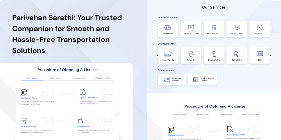
The Parivahan Sarathi website, under the Ministry of Road Transport & Highways, is a crucial digital platform transforming India's vehicular documentation. With over 1300 Road Transport Offices nationwide, it standardizes Registration Certificates and Driving Licenses issuance, overcoming diverse state policies. Centralizing VAHAN for Vehicle Registration and SARATHI for Driving Licenses through the National Informatics Centre, it ensures uniform standards, accuracy, and timely information availability. The user-friendly Parivahan Sewa Portal simplifies processes, provides clear instructions, and aids citizens in vehicle-related activities.
Objective
The primary goal of the website is to simplify and digitize the processes involved in vehicle registration and obtaining driving licenses. By offering online services, the portal aims to reduce the need for physical visits to transport offices, providing a more efficient and user-friendly experience for citizens. Key features of the Parivahan Sarathi Portal include efficient service delivery, uniform standards and interoperability, transparency and accountability, data compilation and management, improved citizen services, quick policy implementation, and enhanced government image. These objectives form the foundation of the website's mission to create a standardized, efficient, and user-centric platform for vehicle documentation processes.
Target Audience
- Citizens Seeking Driving Licenses- Individuals of driving age is looking to obtain new driving licenses, renew existing ones, or acquire learner's licenses. Those applying for dual-driver licenses or checking the status of their driving license applications.
- Vehicle Owners and Buyers- Vehicle owners requiring new vehicle registrations or renewals. Users seek to transfer vehicle ownership, update their addresses, or obtain specific family vehicle numbers.
- Commercial Vehicle Operators- Companies and commercial vehicle operators need permits and managing related transactions. Individuals dealing with issues related to vehicle hygiene and maintenance.
- Transport Department Officials and Authorities- Officials and authorities within the Transport Department responsible for overseeing the issuance of driving licenses and vehicle registrations. Those involved in policy implementation and enforcement at both the state and national levels.
- Other Government Departments- Departments and agencies of the government requiring access to vehicle and driving license information for administrative and regulatory purposes.
- Authorized Third-Party Service Providers- Businesses and service providers authorized to facilitate RTO-related transactions on behalf of citizens and vehicle owners. Entities involved in offering support and services related to driving licenses and vehicle registrations.
- Citizen Advocacy and Consumer Groups- Advocacy organizations and consumer groups interested in monitoring and ensuring transparency, accountability, and user-friendly services in the transport sector.
The Challenge
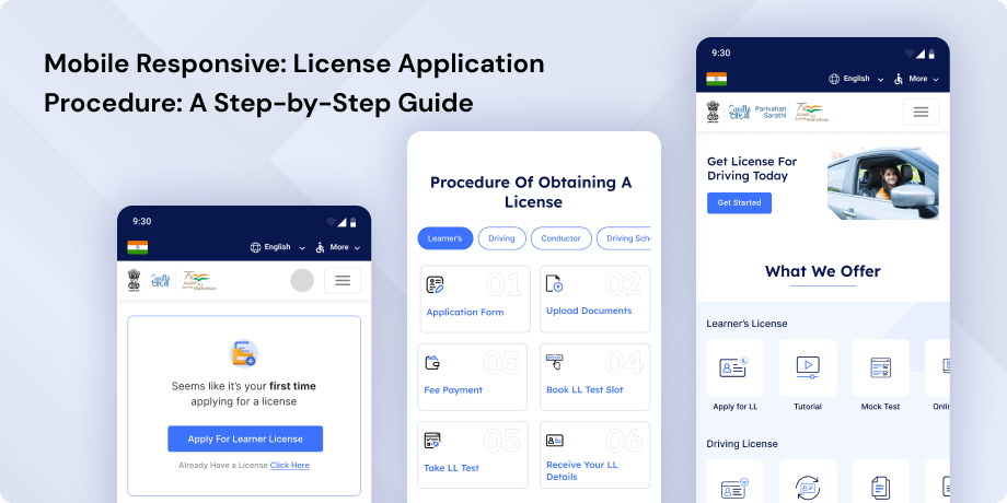
The challenge to optimize the website's user experience involves tackling potential challenges, such as streamlining the search process, improving search flexibility, providing comprehensive feedback and information, ensuring data accuracy and consistency, optimizing mobile responsiveness, prioritizing accessibility, and refining the user interface for intuitive navigation.
Usability Study Findings
The usability study revealed several issues across different sections of the website, impacting user experience and violating UI heuristics principles. Here is a summary of the insights gathered
Homepage- Header Design Issues- Multiple logo placements can create a cluttered and confusing visual experience for users. This can lead to difficulty in identifying the primary brand or purpose of the website. Control elements like page size and language control should be separated into a top header. This separation follows UI heuristics principles, providing a more organized and consistent layout.
- Hero Banner Content-The hero banner is the first thing users see, and if it lacks clear and concise information about the website's purpose and services, users may struggle to understand its value.
- User Restriction on Homepage-Restricting users to selecting a state name only could impede their ability to quickly access relevant information. This conflicts with the UI heuristics principle of flexibility and efficiency of use.
- Footer Placement- Attaching the footer to the banner section deviates from established design standards. For consistency and a standardized user interface, the footer should be appropriately located at the bottom of the webpage.
- Dashboard Sections- Without clear Call to Action (CTA) buttons in each section, users may struggle to understand how to interact with or access specific features. Integrating distinct CTAs within each dashboard section enhances the visibility of the system status. If the CTA button on the navbar lacks intuitiveness, users may find it unclear and struggle to understand its purpose. Improving clarity aligns with the "Recognition Rather than Recall" heuristic.
- Lack of Clear Error Messages-Not providing clear error messages for incorrect username or password inputs violates the "Error Prevention" heuristic. Users need guidance on how to rectify login errors efficiently.
- Back Option as a Button- Presenting the "back" option as a link instead of a button detracts from usability and consistency. Transforming it into a button enhances user interaction.
- Space Between Login CTA and Back Link- Excessive space disrupts visual flow and compromises layout consistency. Maintaining a visually harmonious design is crucial for a cohesive user experience.
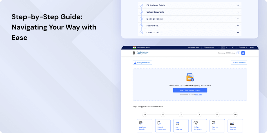
- Overloaded Instructions and Information-Too much information overwhelms users, making it challenging to discern crucial steps in the learner license application process. This violates UI heuristics principles of visibility of system status and recognition rather than recall.
- Visual Differentiation for CTA Buttons-Lack of visual cues for CTA buttons complicates user interaction. Visual distinctions among CTA buttons are essential for improved user navigation.
- Undefined States for CTA Buttons-Without clearly defined states for CTA buttons, users may struggle to navigate effectively. Defining clear states enhances user understanding and interaction.
- Information Overload- Overwhelming paragraphs of text in the E-KYC process may lead to cognitive overload. Streamlining information and providing clear visual cues align with UI heuristics principles.
- Unnecessary Logout on Browser Back Button-Forcing users to log out when attempting to navigate back using the browser's back button represents a departure from the UI heuristics principle of user control and freedom. Consistent and expected behavior is crucial for user experience.
- Excessive Instructions and Process Information-Too many instructions can overwhelm users, hindering quick comprehension. This impacts the UI heuristics principles of visibility of system status and consistency and standards.
- Non-Intuitive "Download Form" Button- Lack of intuitiveness in the "Download Form" button can lead to user confusion about its purpose. Improving clarity aligns with the "Recognition Rather than Recall" heuristic.
- Inadequate Layout of CTA Buttons-Small and closely spaced CTA buttons affect user efficiency and usability. The layout should adhere to UI standards for a consistent and user-friendly experience.
- Missing Navbar on Most Pages-The lack of a consistent navigation bar across most pages causes inconsistency in user navigation. Consistency is essential for a predictable and coherent user experience.
- Instruction Placement-Placing instructions only on the first page may lead to user confusion. Strategic placement throughout the process ensures continuous guidance and reduces the need for users to recall information.
- Unclear CTA Buttons on the "Print Form" Page- The use of unclear CTA buttons may require users to recall their functionality, leading to confusion. Explicit labeling enhances user understanding and interaction.
- Unnecessary and Inactive CTA Buttons- Unnecessary CTA buttons that serve no purpose and lack clarity on functionality can confuse users. Providing transparency in system status is crucial.
- Clarity in Removing Services-Users should be aware of limitations before clicking the "Submit" button. Clear expectations and user control align with UI heuristics principles.
In conclusion, addressing these detailed issues is essential for improving the overall user experience of the website, ensuring it aligns with UI heuristics principles and provides users with a more intuitive, efficient, and consistent interaction.
Ligh House Website ReportThe website's overall performance is rated at 50%, indicating room for improvement. The First Contentful Paint and Largest Contentful Paint metrics are both classified as "very bad," with respective durations of 11.2s and 15.7s. However, Total Blocking Time and Cumulative Layout Shift perform well at 180ms and 0.096s, respectively. Enhancing loading times is crucial for a more optimal user experience.
Synthesizing Phase
With the insights gathered during the research phase, we have gained valuable understanding of the users' interactions and challenges while using the website of Parivahan Sewa, Government of India. Building on this knowledge, we have now entered the Defining phase, where our aim is to deepen our comprehension and transform the research findings into practical design solutions. To maintain a user-centric approach, we have created personas that embody essential user archetypes-
User Personas Persona 1- Rajesh, the Aspiring DriverRajesh, a 22-year-old recent graduate who has just moved to a new city for a job. Rajesh is eager to obtain his driving license to enhance his mobility and independence.
Goals-His primary goal is to navigate the Parivahan Sarathi Portal to understand the process of obtaining a learner's license.
Pain Points-Rajesh's challenges include the complexity of the website's navigation, as he is unfamiliar with the documentation process. He is also concerned about the potential delays and lack of clear instructions that might hinder his ability to quickly obtain the necessary documentation. Rajesh seeks a user-friendly experience that guides him through each step of the application process and provides clear information about the required documents and fees.
Persona 2- Meera, the Responsible Vehicle OwnerMeera, a 35-year-old working professional and a mother of two. Meera recently purchased a new family car and needs to update her vehicle registration with the latest information.
Goals-Her primary goal is to efficiently navigate the Parivahan Sarathi Portal to initiate the vehicle registration renewal process and update her address.
Pain Points-Meera's challenges revolve around the time-consuming nature of traditional processes and the fear of missing any crucial steps. She is also concerned about the accuracy of the information provided on the portal and whether her transaction will be secure. Meera seeks a streamlined and secure online experience that ensures the accuracy of her vehicle documentation and allows her to manage her vehicle-related tasks efficiently.
Mapping User Journeys and Extracting InsightsWe have chosen to focus on Meera, who is a 35-year-old working professional and a mother of two, seeking to renew her vehicle registration and update her address through the Parivahan Sarathi Portal. Let's explore Meera's user journey, gaining insights into her actions, emotions, and pain points during this process.
Mapping the journey to a “user story”Meera struggled with the initial navigation due to the abundance of options. Streamlining the menu and providing a guided pathway could enhance user experience. The document submission step proved challenging for Meera. Intuitive tooltips and a step-by-step guide would mitigate confusion. Meera experienced a brief delay during payment processing. Real-time status updates and a progress indicator could provide reassurance.
Meera's User Story"As a responsible vehicle owner, I want a simplified navigation process, clear instructions during document submission, and real-time feedback on payment processing to efficiently renew my vehicle registration and update my address through the Parivahan Sarathi Portal."
Framing challenges and hypothesis Problem StatementMeera, a conscientious vehicle owner, requires a more intuitive navigation system, clearer document submission guidance, and enhanced feedback during payment processing. The current system's complexities hinder her efficiency in renewing her vehicle registration and updating her address through the Parivahan Sarathi Portal.
Hypothesis StatementIf we optimize the portal's navigation, implement intuitive tooltips for document submission, and enhance real-time feedback during payment processing, then Meera's experience on the Parivahan Sarathi Portal will become smoother and more user-friendly. This, in turn, will lead to increased user satisfaction and efficiency in managing vehicle-related tasks.
In the subsequent phases, we will leverage these insights and hypotheses to design and implement user-centric solutions, ensuring Meera has a seamless and satisfying experience on the Parivahan Sarathi Portal.


