introduction
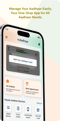
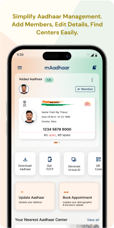
mAadhaar, created by the Unique Identification Authority of India (UIDAI), stands as a versatile mobile application catering to a broad spectrum of smartphone users. It extends Aadhaar services with a commitment to accessibility, boasting support for 12 Indian languages. The application encompasses a personalized section for Aadhaar holders, a multilingual dashboard for diverse services and incorporates features like Aadhaar locking, biometric security and time-based OTPs. Offering support for multiple profiles, the application functions seamlessly offline through SMS. Additionally, it aids users in locating the nearest Enrollment Center, ensuring a comprehensive and user-friendly experience in managing Aadhaar details.
Objective
The objective is to comprehensively evaluate the mAadhaar application, identifying and resolving issues like unclear home screens, suboptimal responsiveness and design inconsistencies. Focused on enhancing user experience, the objective is to ensure usability for Aadhaar holders, smartphone users, multilingual individuals, residents seeking services, users in low-connectivity areas and those needing Enrollment Center information. The goal is to provide constructive feedback to make mAadhaar a seamless and user-friendly platform that caters to a diverse range of users and needs.
Target Audience
The mAadhaar application is designed to serve a diverse audience, primarily targeting individuals residing in India who own smartphones. This inclusive audience comprises of-
- Aadhaar Holders- Individuals already in possession of an Aadhaar card seeking convenient access to Aadhaar services, including information updates and features like Aadhaar locking/unlocking or biometric authentication
- Smartphone Users-Those with smartphones looking for a digital alternative to carrying a physical Aadhaar card, offering a more convenient and portable solution.
- Multilingual Users- Residents who prefer accessing services in their regional language can benefit from the application's support for 12 Indian languages, ensuring accessibility for a linguistically diverse population.
- Residents Seeking Aadhaar Services- Individuals without an Aadhaar card can install the application and register to avail personalized Aadhaar services, expanding the user base beyond existing Aadhaar holders.
- Users in Areas with Limited Network Connectivity- The application's support for Aadhaar services through SMS makes it suitable for users in areas with limited network connectivity, ensuring accessibility in various regions.
- Individuals needing enrollment center information- Users looking for the nearest Aadhaar Enrollment Center can benefit from the application's "Locate the Enrollment Center" feature.
In essence, mAadhaar aims to reach a wide spectrum of users, providing a convenient way to manage Aadhaar information for both existing cardholders and individuals seeking to enroll in the Aadhaar system for the first time.
The Challenge
The audit findings for mAadhaar underscore notable challenges within the application. Concerns include a home screen lacking distinctiveness, suboptimal mobile responsiveness on the appointment portal and inconsistencies in design elements, contributing to a sense of disorder that may result in user confusion and frustration. The absence of intuitive features, such as non-intuitive OTP input boxes and a mismatched color scheme for consent buttons, exacerbates these challenges. It is imperative to rectify these issues to establish a cohesive and user-friendly interface in mAadhaar, guaranteeing a smooth and gratifying interaction for all users.
Usability Study Findings
The mAadhaar application faces usability challenges, including issues with early visibility, UI design, mobile responsiveness, map features, advanced search, side menu organization, profile addition, OTP input boxes, and color consistency. Addressing these concerns is vital for enhancing user experience and overall efficiency. The summarized points are as follow-
- Services (Aadhaar not registered) -Challenge of Early Visibility for "Check Request" Tab Card: The persistent display of the "Check Request" tab card, even without user initiation, leads to space consumption and potential confusion for new users. The design lacks adaptability, compromising the flexibility and efficiency of the user interface.
- Services (Aadhaar Added)- Lack of Distinctive Home Screen and Outdated UI Design: The home screen lacks a distinctive feel, resembling a dashboard rather than a home page. The outdated UI design and the absence of a clear home page deviate from established UI standards, diminishing usability.
- Appointment Portal- Inadequate Mobile Responsiveness on the Appointment Portal Page: The overall mobile responsiveness of the Appointment Portal page is lacking, impacting the flexibility, efficiency of use and consistency expected in a well-designed mobile interface.
- Enrolment Center- Limited Features in the Map on the Enrollment Center: The map feature lacks comprehensive functionality, hindering users from efficiently finding centers. Enhancing the map with advanced search options and more detailed information would improve user experience.
- Advanced Search in the Map- The Advanced Search function is restricted to PIN codes, limiting search refinement. To enhance efficiency, additional search options should be incorporated for a more comprehensive center search.
- Overwhelming Side Menu- The "More" CTA opens a side menu with numerous options, potentially overwhelming users. Organizing options under specific headings would streamline navigation, improving the overall user experience. More (Side Menu in Navigation Bar)
- My Aadhaar-Adding profiles lacks intuitiveness, relying on an ambiguous icon. A dedicated button and a visual indicator for available slots would enhance clarity and reduce user uncertainty. (Non-Intuitive Aadhar Profile Addition)
- Suboptimal UI on Profile Creation Screen- The UI design on the profile creation screen is suboptimal and could benefit from enhancements aligned with current design trends for a better user experience. (Create Profile)
- Non-Intuitive and Small OTP Input Boxes- The OTP input boxes lack intuitiveness and have small dimensions, potentially causing difficulties. Enlarging the boxes and improving their intuitiveness would enhance user interaction.
- Resident Consent- The color deviation of the Resident Consent CTA button disrupts visual harmony and may cause confusion. Aligning the color with established design standards would maintain a cohesive user experience. (Inconsistent Color for Resident Consent CTA Button)
As a result, the summarized usability study identifies issues with early visibility, UI design, mobile responsiveness, map features, advanced search functionality, side menu organization, profile addition, OTP input boxes and color consistency. Improvements in these areas are critical to creating a user-friendly and efficient mAadhaar application.
Synthesizing Phase
With the insights gathered during the research phase, we have gained valuable understanding of the user’s interactions and challenges while using the application of mAadhaar, Government of India. Building on this knowledge, we have now entered the Defining phase, where our aim is to deepen our comprehension and transform the research findings into practical design solutions. To maintain a user-centric approach, we have created personas that embody essential user archetypes-
User Personas Persona 1- Aadhaar Holder - Convenience SeekerPriya, a 32-year-old professional residing in Mumbai, India. Priya is a proud Aadhaar cardholder and is always on the lookout for convenient solutions that enhance her overall user experience with the mAadhaar application.
Goals-Priya's goal is to effortlessly access Aadhaar services, such as information updates and biometric authentication, without being hindered by unclear design elements. She seeks a mAadhaar experience that aligns with established UI standards, providing clarity and ease of use for individuals like herself who rely on the application for efficient Aadhaar management.
Pain Points-Her challenge lies in the lack of a distinctive home screen and an outdated UI design. Navigating the application feels more like maneuvering through a dashboard than a streamlined home page, leading to a sense of disorientation.
Persona 2- New Smartphone User - Accessibility AdvocateRaj, a 25-year-old student living in a rural area with limited network connectivity in Uttar Pradesh, India. Raj is new to the Aadhaar system and prefers the digital alternative offered by the mAadhaar application.
Goals-Raj's goal is to easily register for Aadhaar services through the app, but the current map functionality falls short of providing the necessary information. Additionally, the overwhelming side menu with numerous options adds confusion to his user journey. Raj seeks an mAadhaar experience that caters to users in low-connectivity areas, with an improved map feature and a streamlined side menu for a more accessible and user-friendly interface.
Pain Points-His challenge lies in the application's limited features in the map on the Enrollment Center, hindering his ability to efficiently locate the nearest center.
Mapping User Journeys and Extracting InsightsWe chose Priya, a 32-year-old professional and Aadhaar cardholder who has issues with the home screen and an outdated UI design.
User JourneyPriya, a 32-year-old professional and Aadhaar cardholder, installs the mAadhaar application seeking convenient access to Aadhaar services. However, the lack of a distinctive home screen and outdated UI design during the first interaction create confusion. Attempting to update information and use features like Aadhaar locking, Priya faces challenges due to non-intuitive design elements. Deciding to add a new profile, she encounters difficulties in the process, impacting her overall experience. Mobile responsiveness issues on the Appointment Portal further frustrate Priya and the color inconsistency during the resident consent process disrupts visual harmony.
User Statement"I am Priya, an Aadhaar cardholder seeking convenience through the mAadhaar app. The unclear home screen and outdated UI design create confusion, hindering my ability to efficiently access Aadhaar services like information updates and biometric authentication. I desire a platform that aligns with established UI standards for clarity and ease of use."
Framing challenges and hypothesis Problem StatementPriya faces challenges with the mAadhaar app, including a lack of a distinctive home screen, non-intuitive design elements impacting Aadhaar service accessibility, difficulties in profile management and issues with mobile responsiveness and color consistency. These challenges hinder Priya's seamless interaction with the application and compromise her overall user experience.
Hypothesis StatementIf the mAadhaar application undergoes a redesign to incorporate a distinctive home screen, enhance UI intuitiveness for profile management, improve mobile responsiveness on the Appointment Portal and ensure consistent color schemes, then Priya's user experience will be significantly improved. This will result in a more user-friendly platform for Aadhaar management, aligning with the expectations of convenience-seeking users like Priya.


