introduction
The National Atlas and Thematic Mapping Organization (NATMO) is part of the Indian government's Department of Science and Technology. NATMO has been a pioneer in thematic mapping services, with a unique position as an agency dedicated to meeting the needs of thematic maps and atlases in a variety of sectors. NATMO stays ahead of the curve by incorporating cutting-edge technologies like GIS, GPS and remote sensing into its operations.
NATMO helps to raise awareness about various socioeconomic sectors, which contributes significantly to the nation's planning and development initiatives. Notably, it has the largest repository of spatial and non-spatial data, which is processed with precision and accuracy, emphasizing its importance in the field of geographic information and mapping services.
Objective
The objective of the website audit is to emphasize the significance of improving search functionalities, guaranteeing data precision, and prioritizing mobile responsiveness. Enhancing these aspects is imperative to cultivate a user-centric experience that resonates with user preferences and boosts overall website satisfaction.
Target Audience
The website caters to a diverse user base, including the public, researchers, educators and government officials. It targets those seeking easy access to geographic information, cartographic products and tools for effective exploration, planning and analysis, implementation. The platform's educational resources also make it suitable for students and researchers in the field of geography.
The Challenge
The challenge is to improve the website's user experience while addressing a variety of user needs. These could include streamlining the complex search process, improving search flexibility, providing more informative feedback, ensuring data accuracy and consistency, optimizing mobile responsiveness, improving accessibility features and refining the user interface for greater intuitiveness.( Add details)
Usability Study Findings
The usability study provided valuable insights into user behavior, pain points and preferences. The website's complex search process and limited flexibility caused users to become frustrated. The highlights are as follows-
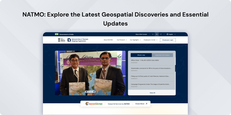
Header & Hero Section- Missing Ministry Name in Header- The header lacks the Ministry name, affecting branding and causing ambiguity about official affiliation. Enhancing visibility in the top header ensures user recognition and reinforces the site's professionalism. (Consistency and Branding)
- Blurred/Inadequately Sized Image Quality in Header Banners- Header banners display blurred and improperly sized images, diminishing visual appeal. Incorporating high-resolution, appropriately sized images enhances the site's aesthetic and professionalism. (Visual Appeal and Aesthetics)
- Absence of Pictorial Representation for Department Leaders- Lack of visuals for department leaders hinders quick identification, impacting user connection with key figures in the organization. Addressing this gap is essential for establishing visual hierarchy and user engagement.
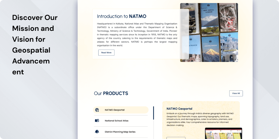
- Lack of Contextual Points for Products- Inadequate contextual information for products creates a usability gap, hindering user understanding. Providing essential contextual points is crucial for informed decision-making and improved user comprehension.
- Placement of “What’s New Section” in the third fold- The current placement reduces visibility and accessibility. Re-evaluating the layout to prioritize visibility is recommended for optimizing user engagement with the latest information.
- Peculiar Text Formatting and Excessive Empty Space- Unusual text formatting and excessive empty space disrupt visual cohesion, affecting readability and aesthetics. Streamlining text formatting and optimizing space usage ensures a more user-friendly design.
- Enlarged Map on the Footer & Repetitive Social Media Icons- The oversized map disrupts the page balance, impacting the overall design. Social media icons cause confusion and visual clutter. Addressing these issues is crucial for layout optimization and improved user experience.
- Missing Dedicated Section for Social Media Preview- The absence of a designated space for social media previews hinders seamless content sharing. Introducing a dedicated section enhances user engagement and aligns with contemporary sharing expectations.
- Lack of Mobile Responsiveness- The site lacks responsiveness on mobile devices, resulting in distorted text and images. Inconsistencies in layout disrupt visual harmony and impede readability. Improving mobile responsiveness is essential for optimal usability across diverse devices.
Therefore, the usability study highlights the importance of enhanced search processes, ensuring data accuracy and prioritizing mobile responsiveness. Addressing these aspects is critical for creating a user-centric experience that aligns with preferences and increases overall website satisfaction.
Light House Report (Website)The Lighthouse report gives the website an overall performance score of 49 out of 100, indicating the need for improvement. The first Contentful Paint is at 3.4s, while the largest Contentful Paint is at 8.8s, resulting in a Speed Index of 4.8s, with a total blocking time of 150ms and a cumulative layout shift of 0.113, indicating average performance that could be improved.
Light House Report (Mobile version)The mobile version's performance, as measured by the Lighthouse report, is currently 34 out of 100, indicating significant room for improvement. Notably, the First Contentful Paint registers at 12.1 seconds, while the Largest Contentful Paint occurs at 23.5 seconds, yielding an 18.7-second Speed Index. However, the total blocking time is significantly low, at around 960 milliseconds (just under 1 second). In contrast, the cumulative layout shift achieves an excellent score of zero.
Synthesizing Phase
With the insights gathered during the research phase, we have gained valuable understanding of the users' interactions and challenges while using the website of National Atlas and Thematic Mapping Organization (N.A.T.M.O), Government of India. Building on this knowledge, we have now entered the Defining phase, where our aim is to deepen our comprehension and transform the research findings into practical design solutions. To maintain a user-centric approach, we have created personas that embody essential user archetypes-
User Personas Persona 1- Researcher RachelRachel, a dedicated researcher, seeks accurate and detailed geographic data for her studies.
Goals-Rachel relies on NATMO's website to explore thematic maps and atlases, analyze data and gather resources for her research projects. Rachel also seeks to stay updated with the latest developments in geographic information and technology.
Pain Points-Rachel faces challenges in navigating the website due to its complex search process and limited flexibility. She struggles to find specific information quickly, hindering her research progress. Additionally, the lack of contextual points for products makes it difficult for Rachel to understand the relevance and features of the available resources, impacting her decision-making process.
Persona 2- Government Official GaryGary, a government official, uses NATMO's website to access geographic data needed for planning and decision-making processes.
Goals-Gary seeks reliable cartographic products, tools for analysis and educational materials to support government initiatives and policies related to planning, development and geographic awareness.
Pain Points-Gary encounters challenges with the website's mobile responsiveness, especially when accessing it on his smartphone while on the go. The distorted layout and text make it challenging for him to access crucial information efficiently. Moreover, the absence of a dedicated section for social media previews hampers Gary's ability to share valuable content with stakeholders effectively.
Mapping User Journeys and Extracting InsightsWe have chosen to focus on Investor Irene, a seasoned business owner and investor looking to explore opportunities in India through the Make in India website. By mapping Irene's user journey, we aim to gain insights into her specific needs, pain points, and behaviors while navigating the website. This will help us better understand how to enhance her user experience and address her challenges effectively.
Mapping the journey to a “user story”We have decided to focus on Rachel, a dedicated researcher who seeks accurate and detailed geographic data for her studies. She uses NATMO's website to explore thematic maps and atlases, analyze data and gather resources for her research projects.
User JourneyRachel begins her user journey by accessing the NATMO website to search for thematic maps and atlases related to her research topic. She navigates through the website's menu to find the relevant section and explores the available resources. After selecting a map of interest, she tries to analyze the data and gather additional information to support her research. However, Rachel encounters difficulties in finding contextual points for the products, which slows down her progress. Despite these challenges, she persists in her search and eventually finds some useful resources that aid her research.
User StoryAs a researcher, I want to easily access thematic maps and atlases related to my research topic on the NATMO website. I need the website to provide clear and intuitive navigation, as well as contextual information for the available products, so that I can quickly find the resources I need to support my research projects and make informed decisions.
User Statement"I need access to accurate and detailed geographic information to support my research projects. The NATMO website should provide me with thematic maps, atlases and educational resources that are easy to find and navigate. However, I often struggle with the complex search process and the lack of contextual information for the products, which hinders my research progress."
Framing challenges and hypothesis Problem StatementRachel faces challenges in navigating the NATMO website due to its complex search process and the absence of contextual points for the available products. These issues slow down her research progress and make it difficult for her to find the information she needs efficiently.
Hypothesis StatementWe believe that by simplifying the search process and providing more contextual information for the products, we can improve Rachel's user experience on the NATMO website. This will enable her to find relevant resources more quickly and effectively support her research projects.


