introduction
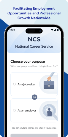
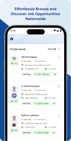
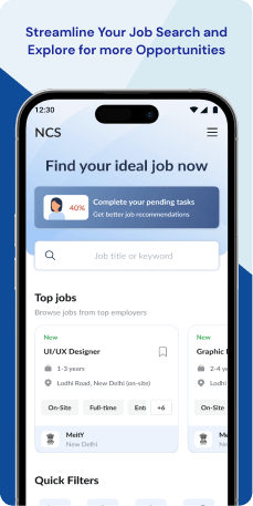
The National Career Service (N.C.S.) mobile application, operated by the Ministry of Labour and Employment of the Government of India, serves as a comprehensive platform for jobseekers. It offers access to diverse employment resources, such as job listings, career counseling, and training for skill development. The application's primary objective is to connect jobseekers with potential employers, fostering employment opportunities and contributing to overall economic growth.
Objective
-
Primary Objectives
- Facilitate effective connections between jobseekers and employers- The redesigned NCS application should streamline communication, match job opportunities with relevant candidates, and offer tools to simplify the hiring process for employers.
- Foster skill development and career growth- Empower users to improve employability and enhance career prospects by providing easy access to skill development resources, career counseling services, and personalized guidance.
- Establish government credibility and trust in the digital space- Serve as a tangible representation of the government's commitment to employment and skill development, instilling trust and credibility in the digital era. Secondary Objectives
- Strengthen government trust and brand perception- Clearly communicate the application's affiliation with the Government of India, highlighting its trustworthiness, reliability, and commitment to user well-being. This approach aims to boost user confidence and encourage broader adoption of the platform.
- Solicit user feedback for continuous improvement- Implement feedback mechanisms within the application to gather user insights, fostering a culture of continuous improvement and allowing the platform to be tailored to better meet the evolving needs of users.
Target Audience
The target users of the NCS application are jobseekers looking for employment opportunities, career development, and skill enhancement. The application also caters to employers seeking to streamline their hiring process. The overarching goal is to connect jobseekers and employers while promoting skill development, with an emphasis on establishing trust in the government-backed initiative.
The Challenge
The NCS application is facing challenges in terms of performance and user retention. This is evident from its low ratings and negative reviews on various application stores, signaling widespread dissatisfaction among users. Moreover, usage metrics indicate that a substantial portion of the target audience is not actively utilizing the app. This lack of engagement is impeding the application's effectiveness in connecting jobseekers with employers, hindering its ability to fulfill its intended purpose.
Usability Study Findings
The usability study reveals several critical insights into the application’s user experience across various stages, highlighting user behavior, pain points, and preferences. Here's a summary of the key findings-
New User- Outdated Design- Users perceive the application's visual appearance as outdated, potentially impacting engagement and giving the impression of a less-maintained platform.
- Unclear Value Proposition- Lack of effective communication about the application's benefits may lead to user confusion and frustration, hindering user retention.
- Lack of User Guidance- Insufficient guidance results in a less intuitive user experience, making it challenging for users to explore and use the application’s features fully.
- Accessibility Concerns- Neglecting basic accessibility handbook, particularly related to text legibility, may exclude users with visual impairments.
- Premature Feedback Option-Placing a feedback button too early in the user journey might discourage exploration and engagement, as users may not have experienced the application sufficiently.
- Limiting User Personas- Restricting users to a single persona contradicts the dynamic nature of their employment needs.
- Comprehensive Information Demands- Demanding extensive personal and professional details upfront can overwhelm users, contradicting the principle of progressive disclosure.
- Single Lengthy Form- Presenting all registration information in a single form may lead to information overload and user errors.
- Immediate Email and Phone Verification- Requiring immediate verification disrupts the onboarding process and creates friction.
- Dual Verification Requirement- Requiring both email and phone verification may be perceived as excessive, potentially discouraging to users.
- Unexpected Email Modification Flow- Opening the login screen for email modification creates an unexpected user flow, violating the principle of clear and consistent actions.
- Oversized Popup Message- An oversized popup message may cause frustration due to its design flaw, violating clear and intuitive design principles.
- Non-Mobile-Friendly Layout- The desktop-like layout may hinder user experience on mobile devices, necessitating a mobile-first design approach.
- Small Touch Targets- Small touch targets increase the risk of mis-clicks and frustration, particularly in a website-like layout.
- Outdated Color Palette- The outdated color palette and inconsistent use of gradients may diminish the application's visual appeal and user engagement.
- Dual Hamburger Menus- Two separate menus introduce unnecessary complexity, violating principles of clear and consistent navigation.
- Complex Navigation Approach- Extensive links and individual pages for each action contribute to cognitive overload and disrupt efficient navigation.
- Overloaded Job Search Filters- Multiple filters upfront cause information overload, distracting users from the primary task of searching for jobs.
- Cluttered Interface- Several buttons create confusion, and the cluttered interface may overwhelm users, hindering their ability to distinguish primary actions.
- Unintuitive Search Results Page Design- The design and placement of elements on the search results page hinder efficient navigation and user experience.
- Excessive Information in Job Listings- Too much information in job listings makes it challenging for users to quickly identify relevant opportunities.
- Non-Standard Back Button Placement- Contradicting the standard back button placement may confuse users accustomed to established conventions.
- Non-Intuitive Counselor Availability Display- The method of displaying counselor availability lacks clarity, making it challenging for users to identify suitable scheduling options.
- Unstable Second Hamburger Menu- The second hamburger menu's instability during scrolling disrupts user flow and access to essential navigation options.
- Overwhelming Long Forms- Long forms with numerous input fields increase frustration and the likelihood of user abandonment.
Therefore, the usability study indicates a need for a comprehensive redesign addressing outdated design, unclear communication, lack of guidance, accessibility issues, and numerous usability challenges across different stages of the user journey. Improving these aspects can significantly enhance the overall user experience, engagement, and retention.
Synthesizing Phase
With the insights gathered during the research phase, we have gained valuable understanding of the users' interactions and challenges while using the application of National Career Service, Government of India. Building on this knowledge, we have now entered the Defining phase, where our aim is to deepen our comprehension and transform the research findings into practical design solutions.
To maintain a user-centric approach, we have created personas that embody essential user archetypes-
User Personas Persona 1: Jobseeker - AnjaliAnjali is a 26-year-old graduate actively searching for a job in the competitive job market. She has downloaded the National Career Service (NCS) application with the hope of finding relevant job opportunities and advancing her career.
Goals-Anjali's primary goals revolve around optimizing her job search experience on the NCS application. She aims to efficiently navigate the platform, finding job opportunities that align with her qualifications and career goals. Anjali is particularly interested in accessing resources for skill development within the app, with the goal of enhancing her capabilities and making herself more marketable to employ. Anjali's overarching aspiration is to have an improved user experience, marked by faster load times and enhanced overall performance, minimizing frustration during her job search.
Pain Points-Anjali's pain points include the overwhelming number of job listings, making it challenging to find positions aligned with her qualifications and interests. She struggles with understanding the skill requirements for various jobs and lacks guidance on how to enhance her skills for better employment prospects. Anjali is frustrated with the application's performance issues, experiencing slow load times and occasional crashes.
Persona 2: Employer - RajatRajat, a 35-year-old HR manager in a medium-sized company, uses the NCS application for recruiting new talent.
Goals-Rajat's key objectives center around making the recruitment process more efficient and effective through the NCS application. His primary goal is to use the platform as a streamlined tool for finding and connecting with qualified candidates, reducing the time and effort traditionally associated with hiring. Rajat specifically desires features within the application that facilitate the identification of candidates with the right skill set for specific job roles, streamlining the shortlisting process.
Pain Points-His main pain points include the cumbersome process of sifting through numerous job applications to find qualified candidates. Rajat finds it challenging to identify candidates with the right skill set for specific job roles, and he lacks efficient tools for shortlisting potential hires. He is dissatisfied with the limited features that the application offers to streamline the hiring process, such as scheduling interviews and communicating with applicants. Additionally, Rajat faces issues with the application's user interface, finding it less intuitive for employers.
Mapping User Journeys and Extracting InsightsWe have chosen to focus on Anjali, a 26-year-old graduate actively searching for a job, to gain comprehensive insights into her needs, pain points, and behaviors while using the National Career Service (NCS) application. Anjali's journey will illuminate the challenges she faces and highlight potential areas for improvement in the application to enhance her overall user experience during the job-seeking process.
Anjali's User Story"As a recent graduate actively seeking employment, I want a more streamlined job search experience on the NCS application. Additionally, I wish to receive timely responses from employers after applying for jobs, and I seek personalized guidance on skill development to enhance my employability."
Framing challenges and hypothesis Problem StatementAnjali, a recent graduate using the NCS application for job search, faces challenges in efficiently navigating job listings, communicating with employers, and accessing personalized guidance for skill development.
Hypothesis StatementIf we enhance the application's navigation for job listings, improve communication channels between jobseekers and employers, and provide more personalized skill development guidance, then Anjali's experience on the NCS application will become more efficient, engaging, and valuable for her job search.
We believe that by addressing these challenges and implementing user-centric solutions, Anjali will have a more productive and satisfying experience while using the NCS application for her job search. In the subsequent sections, we will explore and develop concrete design solutions to meet Anjali's needs and improve her overall user journey on the NCS application.


