introduction
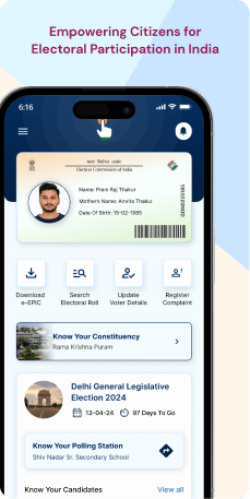
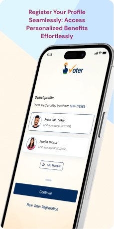
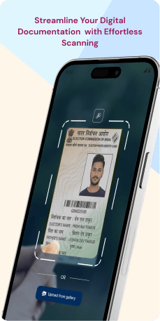
The Voter Helpline Application, created by the Election Commission of India, has garnered significant popularity for its revolutionary impact on how citizens access and engage with voter-related services. Mobile applications have become a vital part of daily life, addressing diverse needs, including electoral processes. From elector registration to correcting demographic details and searching names in the electoral roll, these applications have efficiently connected citizens with the Election Commission, enhancing convenience and effectiveness.
With a simple tap on their smartphones, users can swiftly submit forms and access election-related information directly from the ECI portals. These applications boast a user-friendly interface, simplifying form submissions with just a few easy steps. The entire process, from login to registration, can be completed within minutes, eliminating the need for traditional and time-consuming form submission methods.
Objective
The Election Commission of India's Voter Helpline Application is designed to optimize the voter experience and simplify electoral procedures. Here are the app's key features-
- Registration- Facilitating voter registration for seamless participation in the electoral process.
- Verification- Providing tools for voter verification to ensure accuracy in the electoral roll.
- Digital Photo Voter Slip- Offering a digital alternative for easy access to voter identification.
- Electoral Roll Search- Enabling users to effortlessly search for their names within the electoral roll.
- Form Submission- Streamlining the process of submitting necessary forms through user-friendly features.
- Complaint Filing- Providing a platform for users to file complaints, ensuring transparency in the electoral process.
- News and Updates- Keeping users informed with the latest election-related news and updates.
- Multilingual Support- Catering to diverse linguistic preferences for a more inclusive user experience.
- User-Friendly Interface- Offering an intuitive interface for easy navigation and interaction.
- Election Schedule- Providing users with the upcoming election schedule for better planning.
- Voter Education- Offering educational resources to enhance voter awareness and understanding.
- Polling Booth Locator- Assisting users in finding their designated polling booths effortlessly.
- Push Notifications- Keeping users informed in real-time through push notifications.
- Data Security and Privacy- Ensuring the security and privacy of user data in compliance with standards.
- Feedback Mechanism- Incorporating a feedback system to gather user input for continuous improvement.
Target Audience
The Voter Helpline Application targets citizens eligible to vote in India, offering a seamless and efficient platform for various electoral processes. Users include those registering to vote, verifying details, accessing digital voter slips, submitting forms, searching the electoral roll, filing complaints and staying informed on election news. The application ensures inclusivity with multilingual support, a user-friendly interface and features like polling booth locators and educational resources. It caters to a diverse user base, simplifying engagement with the Election Commission and enhancing overall voter experience.
The Challenge
The application faces several challenges affecting user experience. A cluttered home screen introduces information overload, diminishing user clarity. Inconsistencies in logo color and design language across screens detract from visual cohesion. Repetitive disclaimers and language selection screens disrupt onboarding, potentially frustrating users. Navigation hurdles include the absence of clear return options and unexpected redirects, impeding seamless user journeys. Technical issues, like video player errors and the inclusion of website-like content in sections such as EVM, contribute to a less than optimal experience. Addressing these challenges is essential for enhancing the application's usability and user satisfaction.
Usability Study Findings
The usability study highlights several critical issues across different sections of the application, impacting the overall user experience. Here is a summarized overview of key insights -
Initial Application Screen- Lengthy Disclaimer-The extensive disclaimer at the start may overwhelm users. To improve, consider condensing the content while maintaining legal clarity. This allows users to engage with the application more swiftly.
- Inconsistent Logo Color- The disparity in logo color between screens can affect branding consistency. Synchronize the logo color across all screens for a more unified and professional appearance.
- Expand Language Options- Broaden language options to include a more diverse array of commonly spoken languages. This enhances inclusivity, making the application accessible to a larger audience.
- Provide English Descriptions- Alongside presenting languages in their original form, include English translations or descriptions for clarity. This assists users in understanding available language choices, fostering an informed decision-making process.
- Repetitive Disclaimer and Language Selection- The recurrence of disclaimers and language selection screens on every application launch may frustrate users. Explore alternatives, such as displaying them only during initial installation or providing an option to skip after the first use.
- Implement Onboarding- Enhance user experience with an onboarding process and an optional login/signup feature. This personalizes the home screen and offers flexibility for users who prefer immediate access.
- Intrusive Banner Pop-up- Reevaluate the placement and frequency of banners on the home screen to minimize disruption. Balance the need for announcements with maintaining a user-friendly interface.
- Information Overload- Streamline options on the home screen, prioritize simplicity and establish a clear information hierarchy. This ensures a more intuitive and user-friendly design.
- Use of Pop-Up- opt for a dedicated screen for voter registration instead of a pop-up. This provides a clearer and more focused environment for users to complete the registration process.
- Inclusion of Non-Relevant Options- Streamline the voter registration screen by excluding non-relevant options. Provide clear instructions to avoid confusion and maintain focus on the primary task.
- Unexpected Redirect- Users being redirected to the login screen from voter registration options is confusing. Reassess the navigation flow to guide users seamlessly through the registration process.
- Inconsistent Design Language- Ensure a consistent design language for clickable elements on the election results screen. This improves visual appeal and helps users understand interactive elements.
- Prominent Disclaimer- Condense the disclaimer on the election results screen for improved clarity and information hierarchy. This prevents overwhelming users with excessive details.
- Lack of Navigation Option- Include a clear option to return to the home screen from the election results screen. This enhances overall navigation and user experience.
- Redundant Messages- Streamline messaging during the counting process to avoid redundancy. Consider incorporating interactive elements or progress indicators to keep users engaged.
- Outdated UI- Update the UI to present candidate information in a more visually appealing and modern manner. This contributes to a more immersive user experience.
- Lack of State-Dependent Personalization- Ensure that displayed candidate information corresponds to the user's selected state. This enhances relevance and contextual adaptation.
- Lack of Navigation Option- Include a clear option to return to the home screen for improved navigation.
- Language Dependency- Implement language-dependent display for candidate information to enhance personalization.
- Website-Like Design- Prioritize simplicity and efficiency in presenting election-related information. Tailor the design to align with user expectations for a mobile app.
- Lack of Navigation Option- Incorporate a clear option to return to the home screen for improved navigation.
- Video Player Error- Prioritize effective error prevention and handling mechanisms within the video player. Clear and helpful error messages prevent disruptions to the user experience.
- Incorrect Representation of Videos- Update the presentation of video content to align with current design trends, ensuring a visually appealing and engaging experience.
- Inclusion of Website-Like Content- Optimize content for a mobile application by focusing on mobile-friendly design principles. Ensure that the content is presented in a format conducive to the mobile form factor.
- Left Menu Opening from 'Explore'- Align with user expectations by using a conventional menu icon for accessing the left menu. This enhances the user experience by adhering to widely accepted navigation patterns.
- Inadequate Highlighting- Ensure proper highlighting of the selected option in the navigation bar for intuitive navigation. Visual cues aid users in understanding their current location within the app.
- Use of Logo on Thumbnails- Ensure press release thumbnails feature relevant images to provide users with a quick and meaningful preview of the content.
- Inappropriate Design- Reevaluate the gallery screen's layout and features to align with user expectations for a mobile application. Prioritize visual appeal and user-centric design.
- Lack of Navigation Option- Include a clear option to return to the home screen for improved navigation.
- Visual Presentation for Folders- Enhance engagement by incorporating visual elements and interactivity for gallery folders. This improves the overall gallery browsing experience.
- Inappropriate Display of Categories- Reevaluate the presentation of categories to ensure it aligns with user expectations. Prioritize user-centered design principles for an intuitive experience.
- Misleading Display- Ensure that the Downloads section precisely displays items that have been downloaded. Align the content presentation with user expectations for a transparent representation.
- Dual Input Requirement- Reassess the necessity of requiring both a password and an OTP for the login process. Simplify interactions to enhance the user experience.
- Lack of Information Post-Login- Provide clear information and guidance within the Personal Vault interface to enhance user engagement.
- Inappropriate UI Design- Maintain consistency and visual harmony by adhering to a standardized design language in the Personal Vault screen.
- Inappropriate Pop-Up Message- Ensure pop-up messages are contextually relevant to avoid confusion and disruptions in the user experience.
Therefore, this study highlights the importance of streamlining content, enhancing visual appeal and ensuring a cohesive and user-centric design across different sections of the application. Addressing these issues will contribute to a more intuitive, engaging and user-friendly experience, aligning with the app's objectives and user expectations.
Synthesizing Phase
With the insights gathered during the research phase, we have gained valuable understanding of the users' interactions and challenges while using the application of Voter Helpline, Government of India. Building on this knowledge, we have now entered the Defining phase, where our aim is to deepen our comprehension and transform the research findings into practical design solutions. To maintain a user-centric approach, we have created personas that embody essential user archetypes-
User Personas Persona 1: Avid Voter - MeeraMeera, a 32-year-old professional, is an enthusiastic voter who actively participates in elections at various levels. She values her civic duty and stays updated on political developments. Meera is tech-savvy and prefers using digital platforms for convenience.
Goals-Meera's main objective revolves around easy access to her voter information and the verification of her details in the electoral roll. Additionally, she seeks the convenience of receiving digital photo voter slips, eliminating the necessity for physical identification during elections. Keeping herself well-informed about the election schedule, candidates, and results is another priority for Meera, and she relies on the Voter Helpline Application for this purpose. Moreover, she places a high value on the app's user-friendly interface, which allows her to effortlessly file complaints or raise concerns regarding the electoral process.
Pain Points-Meera is overwhelmed and finds the initial disclaimer on the application to be time-consuming. The inconsistent logo color across screens is affecting the professional appearance and trustworthiness of the app. The repetitive language selection screens and disclaimers during every applicatio launch are frustrating for Meera, making the onboarding process tedious. Additionally, Meera is experiencing information overload on the home screen due to a cluttered layout, making it challenging to navigate efficiently.
Persona 2: First-Time Voter - RahulRahul, an 18-year-old college student, is a first-time voter excited about participating in the upcoming elections. He is new to the electoral process and relies on digital platforms for information and guidance.
Goals-Rahul's primary goal is to register as a voter using the application for the first time. He wants the application to guide him through the voter registration process, providing clear instructions. Rahul aims to stay updated on election-related news and educational resources through the app. Finding his designated polling booth effortlessly is crucial for Rahul's convenience.
Pain Points-Rahul is confused by unexpected redirects, such as being taken back to the login screen during the voter registration process. The intrusive banner pop-ups disrupt Rahul's navigation, and he feels overwhelmed by the cluttered home screen. The lack of a clear return option in various sections, including the election results and candidate information, confuses Rahul during navigation. He also faced challenges in understanding the candidate information section due to the outdated UI, affecting his overall engagement with the application.
Mapping User Journeys and Extracting InsightsWe have chosen to focus on Meera, a 32-year-old professional actively involved in the electoral process, to gain profound insights into her needs, challenges and behaviors while using the Voter Helpline Application. Her user journey sheds light on the hurdles she encounters and emphasizes potential areas for enhancement in the application. This approach aims to improve her overall experience, particularly in the areas of seamless registration and monitoring of grievances related to the electoral process.
User story"As a 32-year-old professional actively engaged in the electoral process, I seek a seamless experience on the Voter Helpline App. I want a quicker onboarding with a concise disclaimer, smoother language selection, and minimal disruptions from banner pop-ups. Additionally, I aim to stay well-informed about my voting rights through the app's educational features. Streamlining the home screen for easier access to information aligns with my preference for efficiency and convenience."
User statementMeera, a 32-year-old professional, actively engages in the electoral process. Her user story revolves around seeking a seamless experience on the Voter Helpline Application. As a voter, she desires effortless registration and monitoring of grievances. Additionally, Meera hopes to stay well-informed about her rights and responsibilities through the app's educational features.
Framing challenges and hypothesis Problem StatementMeera faces challenges in the Voter Helpline Application's usability. These include dealing with a lengthy disclaimer, encountering navigation issues during language selection, and disruptions caused by intrusive banner pop-ups. The cluttered home screen poses challenges in voter information access, affecting Meera's overall user experience.
Hypothesis StatementImproving the onboarding process by condensing disclaimers, optimizing language selection, and minimizing disruptions from banner pop-ups will enhance Meera's initial experience. Addressing inconsistencies in logo color and design language across screens will contribute to a more professional appearance. Streamlining the home screen's layout and reducing information overload will result in a more intuitive and user-friendly design, aligning with Meera's preferences for efficiency and convenience.


